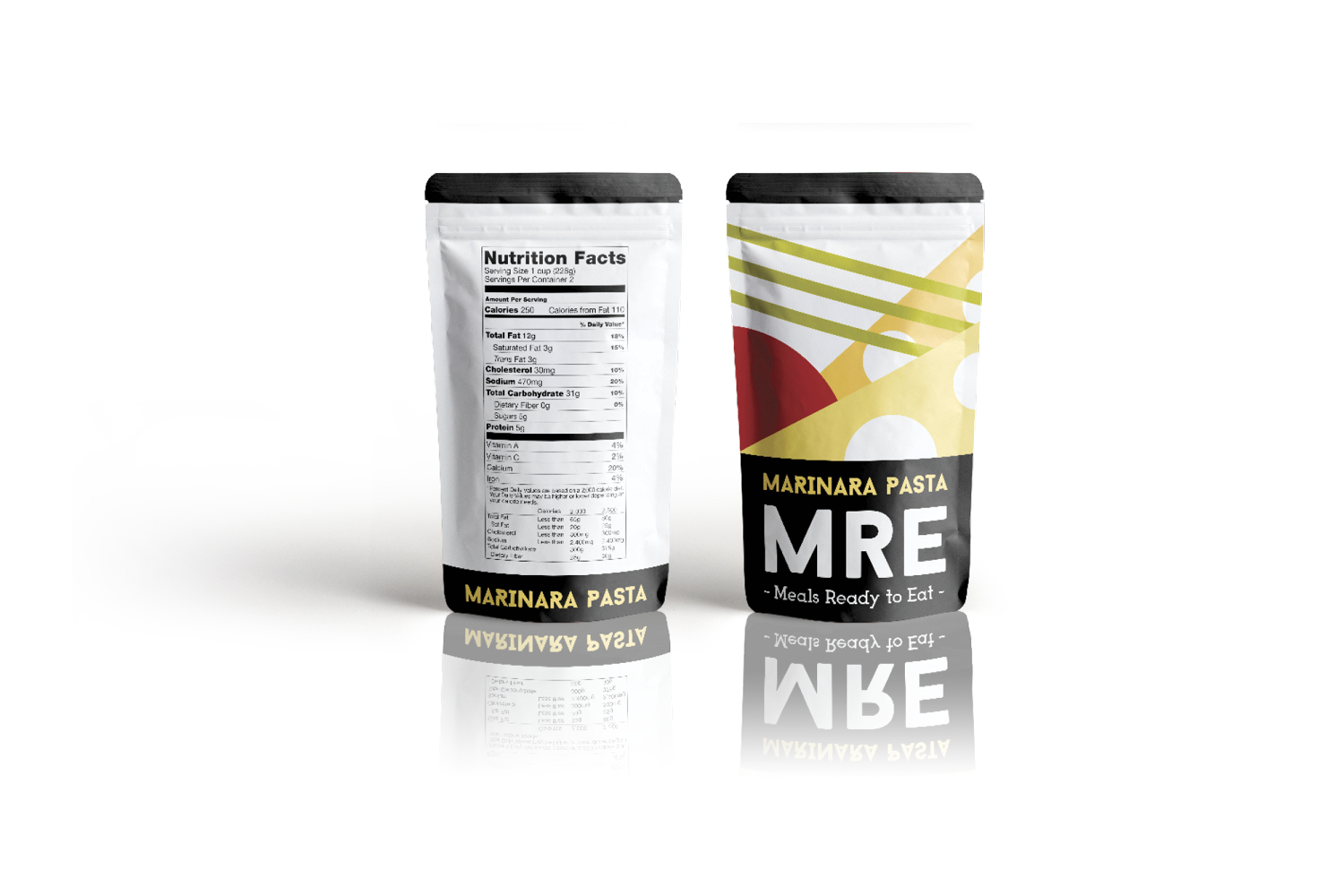
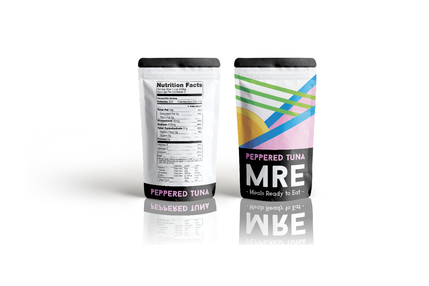
About this project
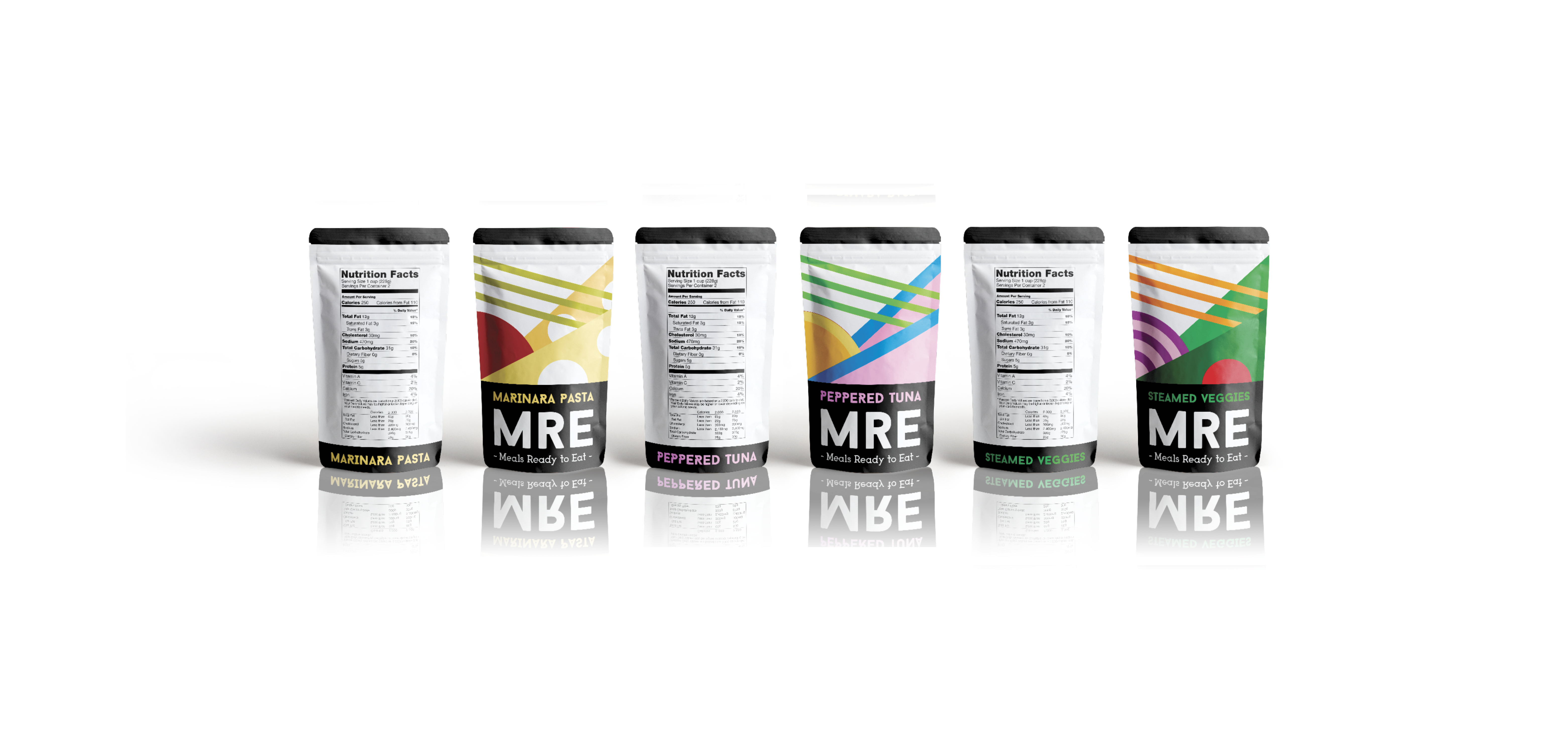
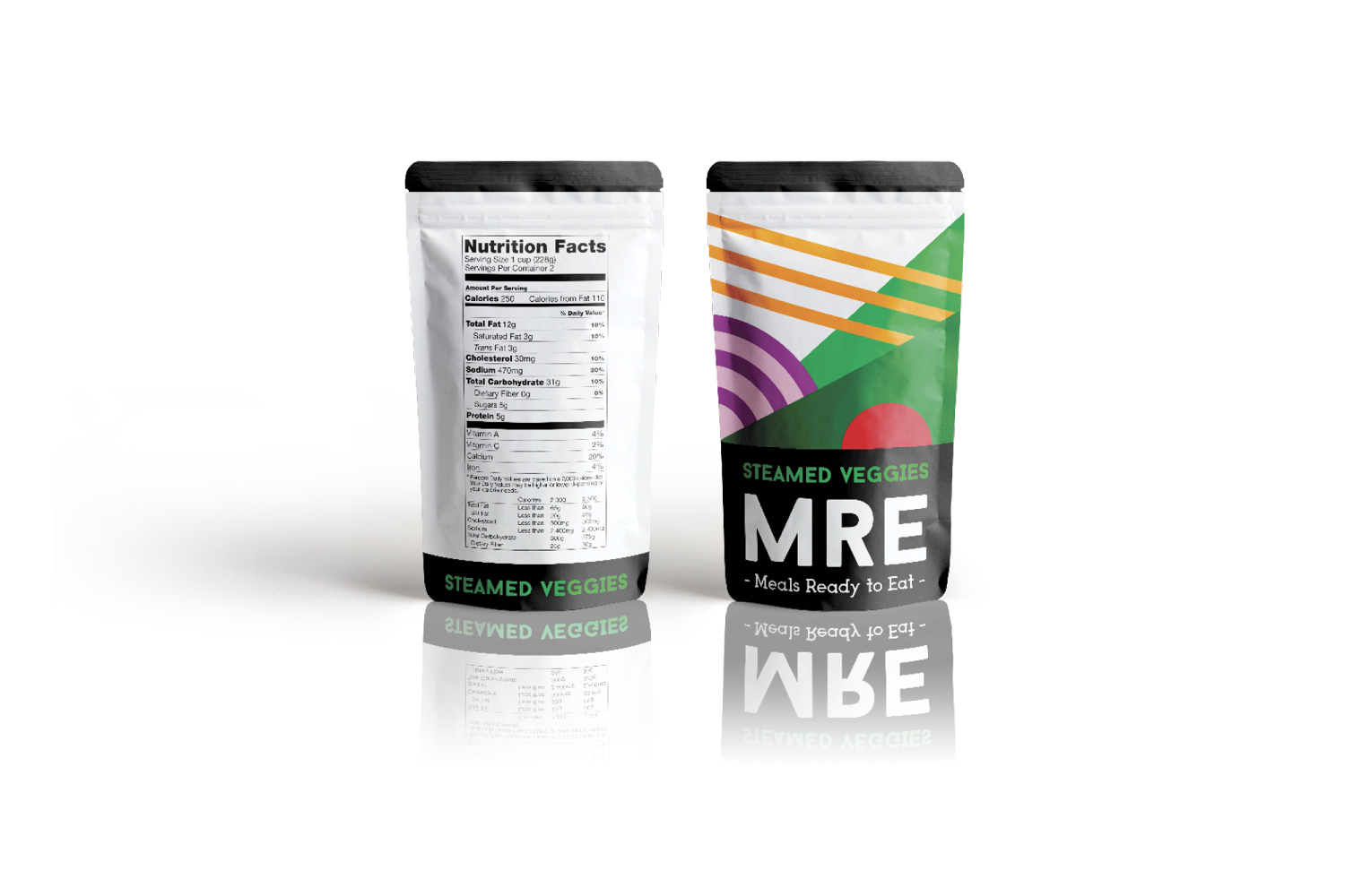
MRE are usually associated with either the military or camping. Therefore, their branding is usually plain and direct. When rebranding this product, I wanted to keep the design direct and simple. However, I also wanted to create a more appealing and colorful product. Since this product is for preserved (freeze dried) foods, the perception of freshness and taste needed to be conveyed. This is accomplished in the rebrand through a modern / clean look, simple and colorful illustrations, and meaningful typography.
Back to portfolio