About this project
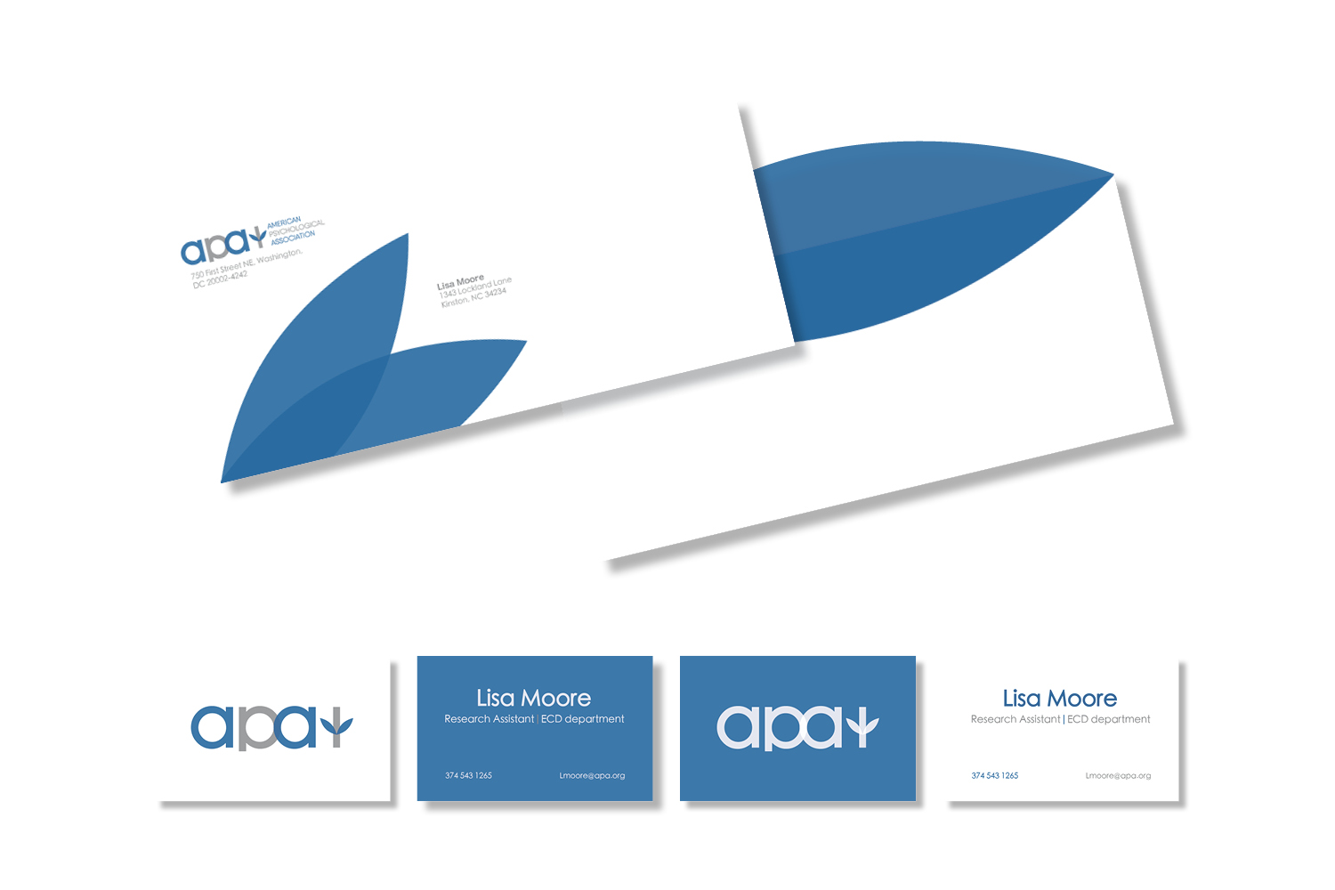
After interning with the APA, I decided to design a rebrand for the organization. The current logo in my opinion, looks dated and awkward in how it is structured. My rebrand refreshes the look of the APA, while keeping the essentials of the current logo. The rebranded logo is easy to read and recognize. The logo itself connects psychologists and the association through the "p" and "a" which forms an infinity symbol. The overlap of the letters is also important, because it represents the contributions and similarities both the psychologists and the association have to offer each other. The rebranded symbol of the APA is meant to reference the Greek letter "Psi" and the simplified image of a sapling. The reason for this is to tie the rebrand to the organization and its past logos, while also promoting the idea for "growth". This rebrand of the APA is meant to simplify the look of the organization, while also keeping the essentials of the current branding.
Back to portfolio